

Get a Free Quote
Tell us what you need and our CleanMitra team will contact you.
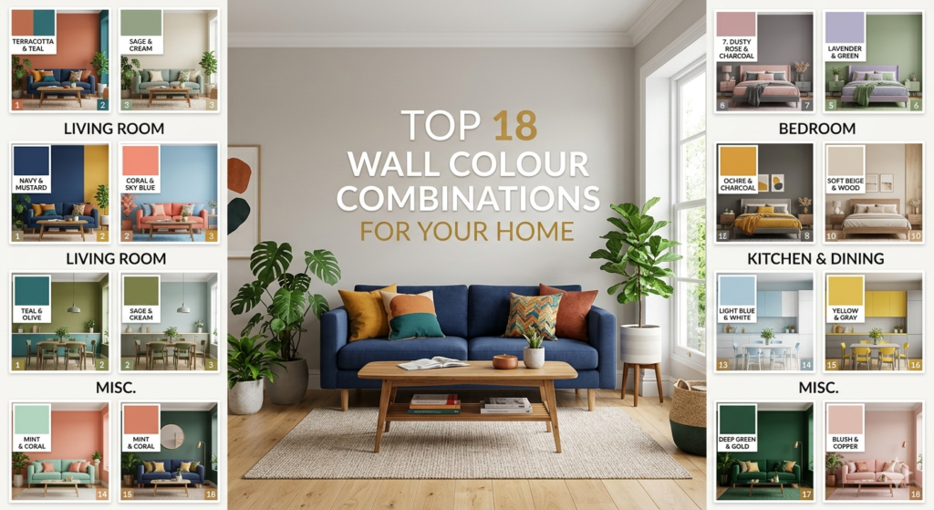
CleanMitra Top 18 Wall Colour Combinations for Your Home
Wall Colour Guide 2026
Top 18 Colour Combinations
for Your Home
The colours you choose change how every room feels. Here are 18 combinations that real homes look beautiful in — with the right rooms for each one.
Colour is the single most powerful — and most affordable — way to transform a home. The right combination does not just look good on a colour chart. It changes the feeling of a room when you walk into it, shifts how large or small a space feels, and reflects natural light in ways that make ordinary homes feel extraordinary. This guide covers 18 of the best wall colour combinations available today, with honest guidance on where each one works best.
Mint Green & White
Mint Green and White is one of the most universally loved combinations for Indian homes. It creates a fresh, clean and soothing atmosphere that feels connected to nature without being overpowering. This combination reflects natural light beautifully and makes any space feel bigger, brighter and more welcoming. White trims and ceilings alongside mint green walls create a crisp, organised look that works across every room type and every furniture style.
Soft Sage & Warm Beige
A deeply grounded combination that brings warmth and nature inside. Sage green walls with warm beige accents feel effortlessly elegant — like a home that has always been this way. Works beautifully with wooden furniture and natural textures.
Off-White & Terracotta
Terracotta has been the most requested accent colour across Indian homes in 2026. Paired with a soft off-white base, it brings extraordinary warmth and a Mediterranean richness that ages beautifully. Use terracotta on a single feature wall for maximum impact.
Deep Navy & Crisp White
Bold, sophisticated and timeless. A deep navy feature wall behind a bed or sofa creates a sense of depth and drama that elevates an entire room. White ceilings and trim keep the space from feeling heavy. Popular in master bedrooms and home offices.
Powder Blue & Soft Grey
Serene and airy, this combination creates a sky-like calm that works beautifully in rooms that receive morning light. Powder blue brings gentle colour without demanding attention. Ideal for creating a relaxed, unhurried atmosphere.
Blush Pink & Warm White
Blush pink has moved beyond children’s rooms into mainstream living spaces and master bedrooms. The modern approach uses a dusty, muted blush rather than a bright pink — creating a sophisticated softness that feels contemporary and warm simultaneously.
Forest Green & Cream
Deep, confident forest green paired with a soft cream creates one of the most luxurious combinations available. It connects the interior to nature in a bold, intentional way — nothing shy about this choice. Pairs exceptionally with natural wood tones and brass accents.
Charcoal Grey & White
The ultimate modern combination. Charcoal grey is sophisticated, strong, and versatile — it works as a full wall in rooms with good light, or as a strong feature wall in any room. White accents keep the space crisp and prevent heaviness. A timelessly elegant choice.
Lavender & Soft White
Lavender walls in a muted, dusty tone create the most restful sleeping environment of any colour combination. It is calming on the nervous system, pairs beautifully with white bedding, and brings a gentle femininity without being overpowering. Consistently one of the top bedroom choices.
Warm Yellow & White
A warm, buttery yellow brings sunshine into any room regardless of the actual light coming through the windows. It is an energising, joyful colour that pairs simply with white. Best used in north-facing rooms that need warmth, or in kitchens where it adds a cheerful vitality to daily cooking.
Dusty Rose & Grey
Dusty rose and grey is the combination that interior designers reach for when they want something that feels both warm and contemporary. The grey grounds the rose and prevents it from feeling saccharine. Together they create a space that is quietly sophisticated.
Sky Blue & Cream
Sky blue and cream is the combination that makes a room feel like a permanent holiday. It is open, light and deeply calming. Used throughout a living room with cream furnishings it creates the kind of airy Mediterranean feel that makes every day feel a little less rushed.
Deep Teal & Ivory
Deeply confident and beautifully dramatic. Teal is a colour that commands attention without being aggressive. Paired with ivory, it creates a rich, jewel-box feeling particularly suited to formal living rooms, dining areas, or any space where you want to make a genuine statement.
Warm Peach & White
Peach is the most underused colour in Indian homes and one of the most rewarding. It is warm without the intensity of orange, cheerful without the brightness of yellow. Peach makes skin tones look beautiful, which makes it an excellent choice for dining rooms and social spaces where people gather and conversation flows.
Greige & Pure White
Greige — the perfect blend of grey and beige — is the most versatile and most fool-proof neutral available. It works with every furniture colour, every flooring type, every lighting condition. If you are unsure what colour to choose and want a result you will never regret, greige and white is the answer.
Olive Green & Warm Tan
Olive and tan is the earthy combination that feels equally at home in a contemporary flat or a traditional bungalow. It is grounded, warm, and aged in the most beautiful sense — a combination that looks better every year as the natural patina of the home develops around it.
Slate Blue & Linen
Slate blue sits between deep navy and powder blue — confident enough to make a statement but calm enough for everyday living. Paired with linen, it creates a coastal-meets-classic combination that is both relaxed and polished. Works exceptionally in homes with wooden flooring.
Burnt Orange & Deep Brown
The most daring combination on this list — and potentially the most stunning in the right room. Burnt orange with deep brown is warm, rich, and intensely Indian in its sensibility. Ideal as a single feature wall in a living room or dining area where the impact of arrival into the space matters. Use sparingly, use boldly.
Pick by the Feeling You Want
Not sure which combination is right for you? Start here — match the mood you want each room to have, not just the colour you like in isolation.
For Calm & Rest
- Mint Green & White
- Lavender & Soft White
- Powder Blue & Soft Grey
- Sage & Warm Beige
For Energy & Life
- Warm Yellow & White
- Burnt Orange & Brown
- Terracotta & Off-White
- Sky Blue & Cream
For Luxury & Drama
- Deep Navy & White
- Forest Green & Cream
- Deep Teal & Ivory
- Charcoal Grey & White
→ Rules That Always Work
- Always paint ceilings white — coloured ceilings make rooms feel lower and heavier
- Test paint on the actual wall before committing — never decide from a small shade card under shop lighting
- One strong feature wall is more effective than four coloured walls in most Indian homes
- Warm colours make small rooms feel cosier — cool colours make them feel larger
- Natural wood tones pair beautifully with greens, warm whites, and earthy neutrals
→ Common Mistakes to Avoid
- Do not choose paint colour based on what it looks like on a phone or laptop screen
- Avoid choosing a different colour family for each room in an open-plan home
- Do not use flat matt finish in kitchens or bathrooms — use semi-gloss or satin
- Never skip primer — it is what makes paint last twice as long
- Do not paint over damp or fungus-stained walls — treat first, paint after
CleanMitra
CleanMitra gives you the best colour combinations that make your home shine like a heaven — and the professional team to apply them perfectly, every single time.