

Get a Free Quote
Tell us what you need and our CleanMitra team will contact you.
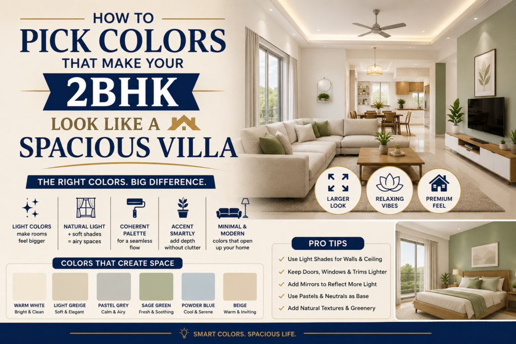
How to Pick Colors That Make Your 2BHK Look Like a Spacious Villa
A practical color strategy guide for Chandigarh, Mohali, Zirakpur & Ludhiana homeowners who want a bigger feel — without a bigger budget.
Most 2BHK owners across the Tricity region assume that “spacious” is something only a villa budget can buy. It isn’t. In nine out of ten homes we’ve worked on, the gap between “boxy and cramped” and “open and airy” wasn’t a single square foot of construction — it was the wrong colors fighting the room’s natural light.
You walk into your own living room after a long day, and instead of feeling like you’ve arrived somewhere, the walls seem to close in a little. The same 950 sq. ft. that looked bright in the builder’s brochure now feels like a corridor with furniture in it. Sound familiar?
This isn’t about your house. It’s about how color was applied to your house. A 2BHK in Sector 70 Mohali and a 2BHK in Zirakpur’s VIP Road belt can be the exact same carpet area, yet one will photograph like a studio apartment and the other will feel like the entry hall of something much bigger — purely because of how light, undertone, and contrast were planned room to room.
In this guide, we’ll walk through the exact color logic that creates a “villa effect” inside a compact floor plan — the kind of layered, intentional approach a professional colour consultant uses, broken down so you can either DIY it confidently or brief your painter with precision.
SECTION 01Why Most 2BHKs in Punjab Feel Smaller Than They Are
Before picking a single shade, it helps to understand why compact homes in this region specifically struggle with a “small” feeling — because the fix changes depending on the cause.
It’s Rarely About Square Footage
A 2BHK in Chandigarh’s Sector 41 or a Ludhiana DLF colony unit is usually 750–1100 sq. ft. That’s genuinely enough space to feel comfortable — hotel rooms half that size feel luxurious because of how light and color are handled, not because of floor area. The real culprits we see on every site visit are:
- Low natural light penetration — many Tricity apartments face narrow lanes or adjoining towers, cutting usable daylight hours significantly compared to independent villas.
- Box-shaped rooms with no focal hierarchy — when every wall is the same shade, the eye has nowhere to “land,” and the brain reads the room as a sealed box rather than a space with depth.
- Heavy, dark furniture against heavy, dark walls — a common combination in North Indian homes that, while elegant individually, eats visual breathing room when stacked together.
- Punjab’s specific climate behavior — strong summer glare bouncing off harsh whites, and monsoon humidity dulling matte finishes within a season, both distort how a color actually reads after the first few months.
The Villa Effect, Defined
When people say a home “feels like a villa,” they usually mean three specific sensations stacked together: a sense of visual continuity from one room into the next, walls that appear to recede rather than close in, and enough tonal contrast that the eye perceives depth instead of flatness. None of these require knocking down a wall. All three are achievable purely through color sequencing.
SECTION 02The Five Color Principles That Create Spaciousness
1. Light Reflectance Value (LRV) Is Your Real Budget
Every paint shade has a Light Reflectance Value — essentially a measure of how much light it bounces back into the room versus how much it absorbs. For compact Punjab apartments, this number matters more than the color name on the shade card.
As a working rule for 2BHKs with average-to-low daylight (most units below the 6th floor in dense Tricity sectors):
| Room Type | Ideal LRV Range | Effect |
|---|---|---|
| Living Room | 55–75 | Bright without feeling sterile; bounces light into adjoining areas |
| Bedrooms | 45–65 | Calming but not gloomy; retains warmth in winter light |
| Kitchen | 60–80 | Maximizes task lighting, hides grease marks better at higher LRV |
| Balcony / Utility | 65–85 | Reflects harsh outdoor glare back outward, cooling the interior |
Going pure white (LRV 90+) everywhere is a common but flawed instinct — it often creates glare under Punjab’s intense afternoon sun and reads as flat and “rented” rather than spacious. A slightly warmer off-white sitting in the 65–75 LRV band almost always looks bigger in photographs and in person.
2. The 60-30-10 Rule, Adapted for Small Rooms
Interior designers use a 60-30-10 split — 60% dominant wall color, 30% secondary (furniture, larger soft furnishings), 10% accent. In a 2BHK, we tighten this slightly to 65-25-10, because smaller rooms can’t absorb as much visual competition before they start to feel busy.
- 65% — Wall base: A single calm, light-to-mid tone carried across the main walls.
- 25% — Secondary layer: Curtains, sofa upholstery, or a single feature wall in a complementary deeper shade.
- 10% — Accent: Cushions, art, or a door frame in a confident contrast color.
3. Vertical Continuity Beats Horizontal Contrast
One of the fastest ways to make a low-ceiling 2BHK room (most fall in the 9–10 ft range) feel taller is to carry the wall color up and slightly onto the ceiling edge, rather than stopping sharply at a contrasting white ceiling. A ceiling painted two to three shades lighter than the wall — rather than stark white — removes the “lid” effect that makes rooms feel capped.
4. One Continuous Undertone Across Connected Rooms
In open-plan or semi-open 2BHK layouts common in newer Zirakpur and Mohali developments, the living-dining-kitchen often share visual sightlines. If each zone uses a different colour family (say, a cool grey living room next to a warm beige dining alcove), the eye registers a “stop” at each transition — which subconsciously shrinks the perceived total area. Using one warm or one cool undertone family throughout, even with different intensities room to room, lets the eye travel uninterrupted, which is what creates that elongated, villa-like sense of flow.
5. Strategic Darkness, Not Avoidance of It
A persistent myth is that small rooms must always be light. In reality, a deliberately darker accent wall — done correctly — can make a room feel larger by creating a sense of depth and “disappearing” a far wall into shadow, drawing the eye past it. The mistake is using dark color randomly; the fix is using it only on the wall furthest from the main light source, never on walls adjacent to windows.
SECTION 03Room-by-Room Color Strategy for a 2BHK
Living Room: The First Impression Zone
This is the room that needs to do the heaviest lifting for the “villa feel,” because it’s usually the first space guests see and the one with the most furniture density.
- Choose a warm off-white, soft sand, or pale sage as the base — these sit in the ideal LRV range and pair well with both wooden and white furniture common in Punjab homes.
- If you have a TV wall or sofa-backing wall that doesn’t receive direct window light, this is your candidate for a deeper accent — a muted teal, charcoal, or deep terracotta works well against lighter surrounding walls.
- Avoid placing any deep accent on a wall directly beside a window or balcony door — it will compete with the light source and flatten the room instead of deepening it.
Bedrooms: Calm Without Going Cave-Like
Bedrooms in Tricity apartments are frequently the most light-starved rooms, especially second bedrooms facing the building’s interior side. Resist the instinct to “brighten” with stark white — it often looks clinical under tube lighting at night. Soft greys with a hint of warmth, dusty blues, or muted clay tones in the mid-LRV range read as both spacious and restful.
Kitchen: Function First, But Light-Smart
Modular kitchens in compact apartments benefit enormously from higher-LRV wall colors above the counter line, since this is where most artificial lighting bounces. Pale yellows, warm whites, or soft mint tones keep the space feeling clean and expand the sense of counter space even when the actual layout is narrow.
Balconies & Utility Areas: Your Secret Weapon
An often-overlooked trick: painting the balcony or utility wall visible from your living room in a tone that’s a lighter, brighter version of your living room color creates a “borrowed view” effect — the eye reads the balcony as an extension of the living space rather than a separate, smaller box, which visually adds several feet to the room.
SECTION 04Climate-Smart Color Choices for Punjab Homes
Color selection in this region can’t be separated from how Punjab’s seasons treat a painted surface. We factor this into every consultation because a shade that looks perfect on a sample card in March can behave very differently by August.
Summer Heat & Glare
South and west-facing rooms in Chandigarh, Mohali, and Ludhiana take direct, intense sun for several hours daily through peak summer. Very high-LRV whites can produce uncomfortable glare in these rooms; a slightly toned-down warm white or soft beige absorbs just enough light to stay comfortable while still reading as bright.
Monsoon Dampness
Tired of peeling paint after every monsoon in Chandigarh? This is almost always a surface preparation and product issue rather than a color issue — but color choice does interact with it. Darker, saturated colors on exterior-facing or bathroom-adjacent walls can visually mask early-stage moisture staining for longer, buying you time before it needs attention, while very pale colors show even minor dampness or fungal spotting almost immediately.
| Season | Risk | Color Strategy |
|---|---|---|
| Summer (Apr–Jun) | Glare, heat absorption on dark exteriors | Mid-to-high LRV tones; avoid near-black exteriors on west walls |
| Monsoon (Jul–Sep) | Dampness, efflorescence, fungal spots | Avoid pure white near bathrooms/kitchens; use washable, moisture-resistant finishes |
| Winter (Nov–Feb) | Rooms feel duller under shorter daylight | Warm undertones (not cool greys) to retain a sense of brightness |
SECTION 05The CleanMitra Difference: Why Surface Prep Decides Whether Your Color Strategy Even Works
Here’s something most color guides skip entirely: the exact same shade can look completely different — and behave completely differently over time — depending on what happens before the first coat goes on. This is the single biggest variable between a “villa-like finish” and a result that looks patchy within a year.
Typical Local Contractor Approach
- Paint applied directly over old, chalky, or uneven surfaces
- Minimal or no crack filling before painting
- Primer skipped or used inconsistently to cut cost
- Single coat application to save material
- No moisture or alkalinity testing on walls
The CleanMitra Approach
- Full surface inspection, sanding, and crack/putty treatment first
- Wall moisture and alkalinity checked before product selection
- Correct primer matched to wall condition, applied evenly
- Recommended coat count followed for true, uniform color depth
- Premium, weather-graded materials suited to Punjab’s climate
A light, high-LRV color especially will show every surface imperfection — bumps, old patch marks, uneven texture — far more obviously than a busy, dark color would. This means the “villa effect” colors we’ve recommended above are also the most demanding on surface quality. Skip proper prep, and even the most carefully chosen shade will look uneven within months as it ages unevenly across patched and unpatched sections.
This is also why two homes using the identical shade code can produce completely different results — one looking crisp and spacious two years later, the other looking blotchy within one monsoon season.
SECTION 06A Simple Room-Mapping Exercise Before You Buy a Single Tin
Before finalizing anything, walk through your home at three different times — morning, midday, and after sunset with your regular lights on — and note how each room actually behaves. Most color mistakes happen because a shade was chosen under one lighting condition (often a bright shop sample under fluorescent light) and never tested under the home’s real, mixed lighting across the day.
Test Before You Commit
Get a small sample painted directly on the wall (not just a card held up) in at least two different rooms, and check it at three different times of day before finalizing.
Map the Light First
Note which rooms get less than 2–3 hours of direct daylight — these need the highest-LRV, warmest undertones in your whole palette.
Plan Room-to-Room Flow
Sketch a simple floor plan and mark which walls are visible from which other rooms — this tells you where undertone continuity matters most.
Budget for Prep, Not Just Paint
Set aside a portion of your budget specifically for surface preparation — it’s what determines whether your color choice actually lasts.
Math can be confusing. Do not worry about manual calculations. Please visit our painting cost calculator for a free, instant estimate tailored to your home.
SECTION 07Frequently Asked Questions
Which color makes a small 2BHK look the biggest?
There’s no single universal “biggest-looking” color — it depends on the room’s natural light and what it’s viewed against. As a general starting point, warm off-whites and soft sand tones in the 60–75 Light Reflectance Value range work reliably across most Punjab apartments because they bounce available daylight without creating glare, and they pair well with both light and dark furniture commonly used in the region.
Should I paint my whole 2BHK in one single color to make it feel bigger?
A single identical color on every wall can actually flatten a space rather than expand it, because there’s no contrast for the eye to read depth from. The more effective approach is one consistent undertone family (consistently warm or consistently cool) used across connecting rooms, with subtle variation in intensity from room to room and one deliberate accent wall placed away from direct light sources.
Do dark accent walls make a small room feel smaller?
Not when placed correctly. A dark accent wall positioned on the far wall from your main light source — away from windows and doors — tends to recede visually and add a sense of depth rather than closing the room in. The mistake that does shrink a room is using dark color on multiple walls, or on a wall directly beside a window, where it competes with and dims the incoming light.
Bringing It All Together
A 2BHK doesn’t need extra square footage to feel like a villa — it needs a color strategy that respects how light actually moves through it, an undertone that stays consistent from room to room, and surface preparation that lets the chosen shade age the way it’s meant to. Get the LRV range right for each room, keep your darker accents away from window walls, let your balcony borrow visual space for your living room, and the compact footprint stops feeling like a limitation.
Ready to start your home transformation? Please visit our painting cost calculator for a free estimate, or reach out to us on WhatsApp to speak with our experts.